Location-based web application
Project date: 2022
UI refresh: 2025
The interface was refreshed for a 375 pt viewport, aligning social sign-in branding with current iOS safe-area standards.
Introduction
Because location-based recommendation apps have become so essential and widely used, I chose this topic for my personal UX/UI case study.
As an expat, I find these apps invaluable for discovering new places and staying informed about what’s happening nearby with ease and speed. They’re equally useful when exploring your hometown or planning a trip to a new destination.
My role
As the UX/UI designer for this project, I managed the entire process starting from competitive analysis, user research, information architecture, user testing and visual design.
The app
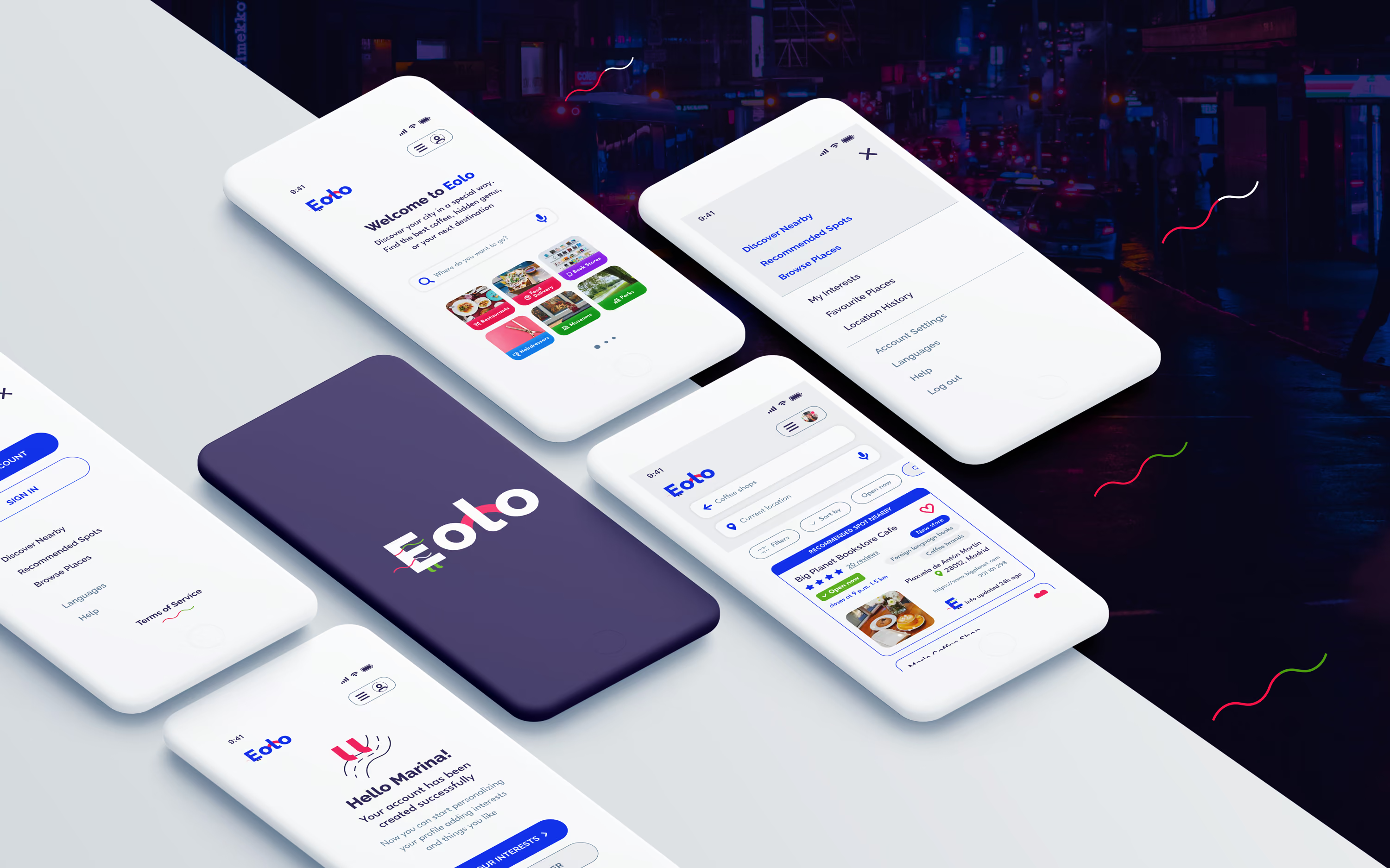
Eolo is a location-based app that helps users to find a specific place, service or shop. It provides alternative routes, tailored recommendations and notifications allowing users to better understand the surroundings based on their interests and preferences.
The app can be used while walking, driving, or using public transportation. It is designed for users who want a more accurate and reliable guide when heading to a specific place, as well as for those seeking a more engaging experience by exploring the surrounding area. The app provides this by sending notifications about nearby events and newly opened shops.
The problem
Many location-based apps often provide unclear, non updated information regarding a specific shop/position, or suggest longer routes, which force users to switch to a second application to complete their tasks. Users expect the app to deliver a more personalized experience, including tailored suggestions, contextual support, and adaptable content that matches their individual preferences and needs.
Research and planning
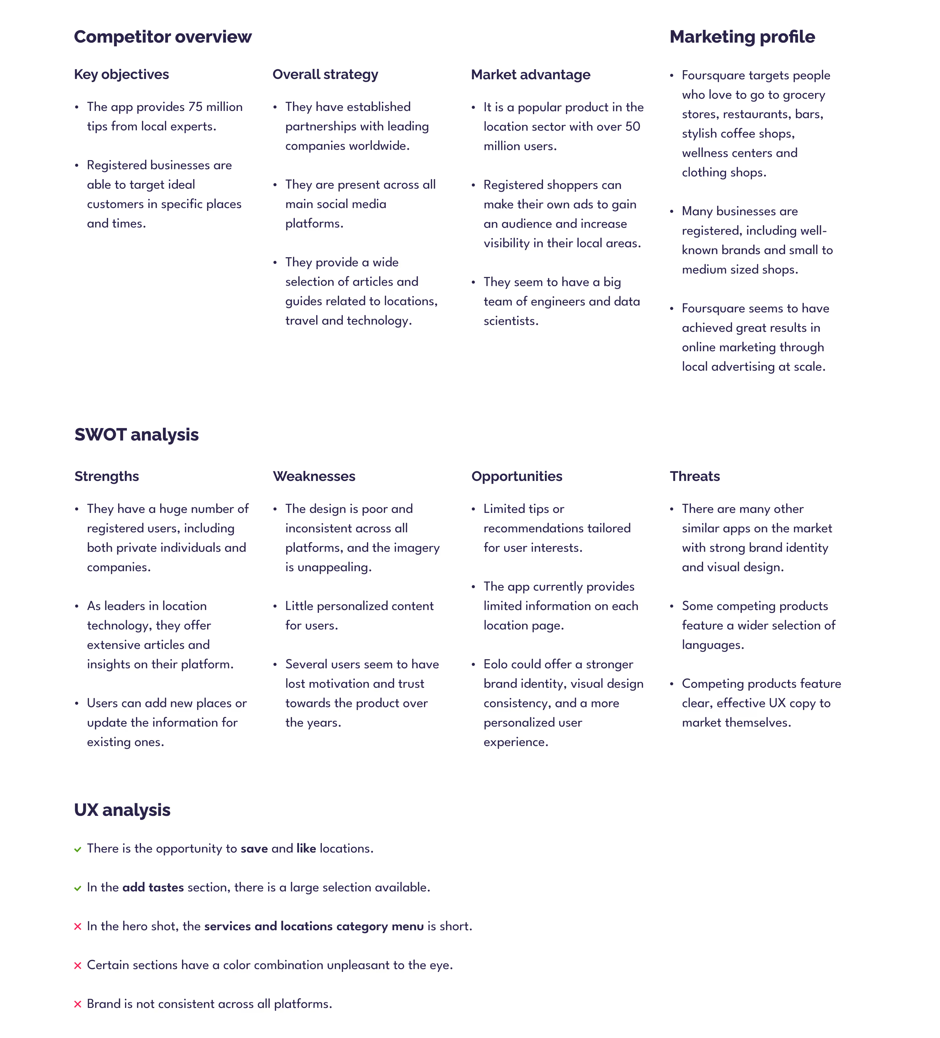
Competitive analysis: Foursquare City Guide
Created in 2022 and retained from the initial project; it has not been updated for the 2025 UI refresh.
At the time of the analysis, Foursquare City Guide was selected as a competitor because of its established presence in location-based discovery and place-search services.
User interview
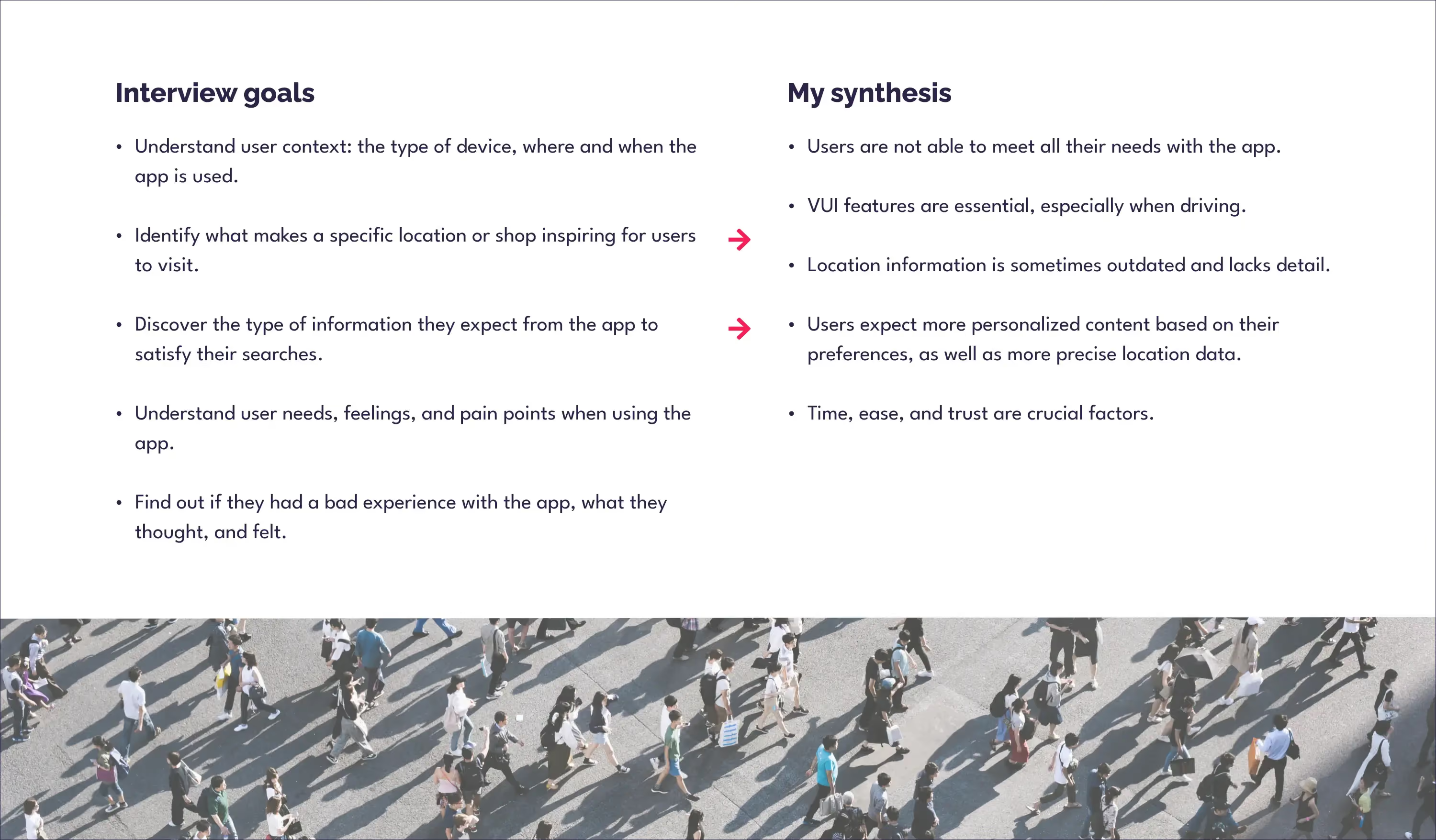
I interviewed three frequent users of similar apps in varied daily contexts. Each had distinct backgrounds and nationalities.
User personas
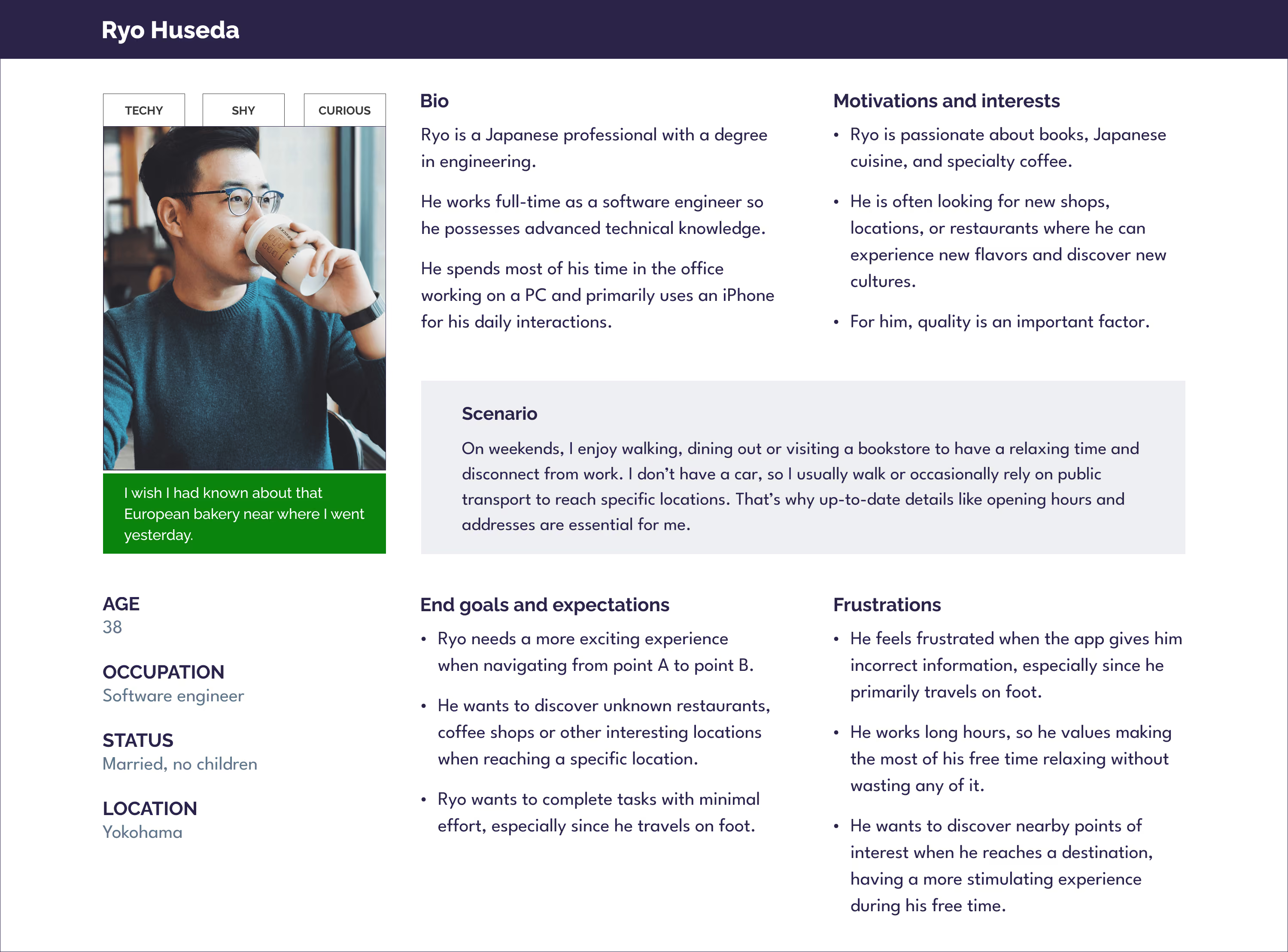
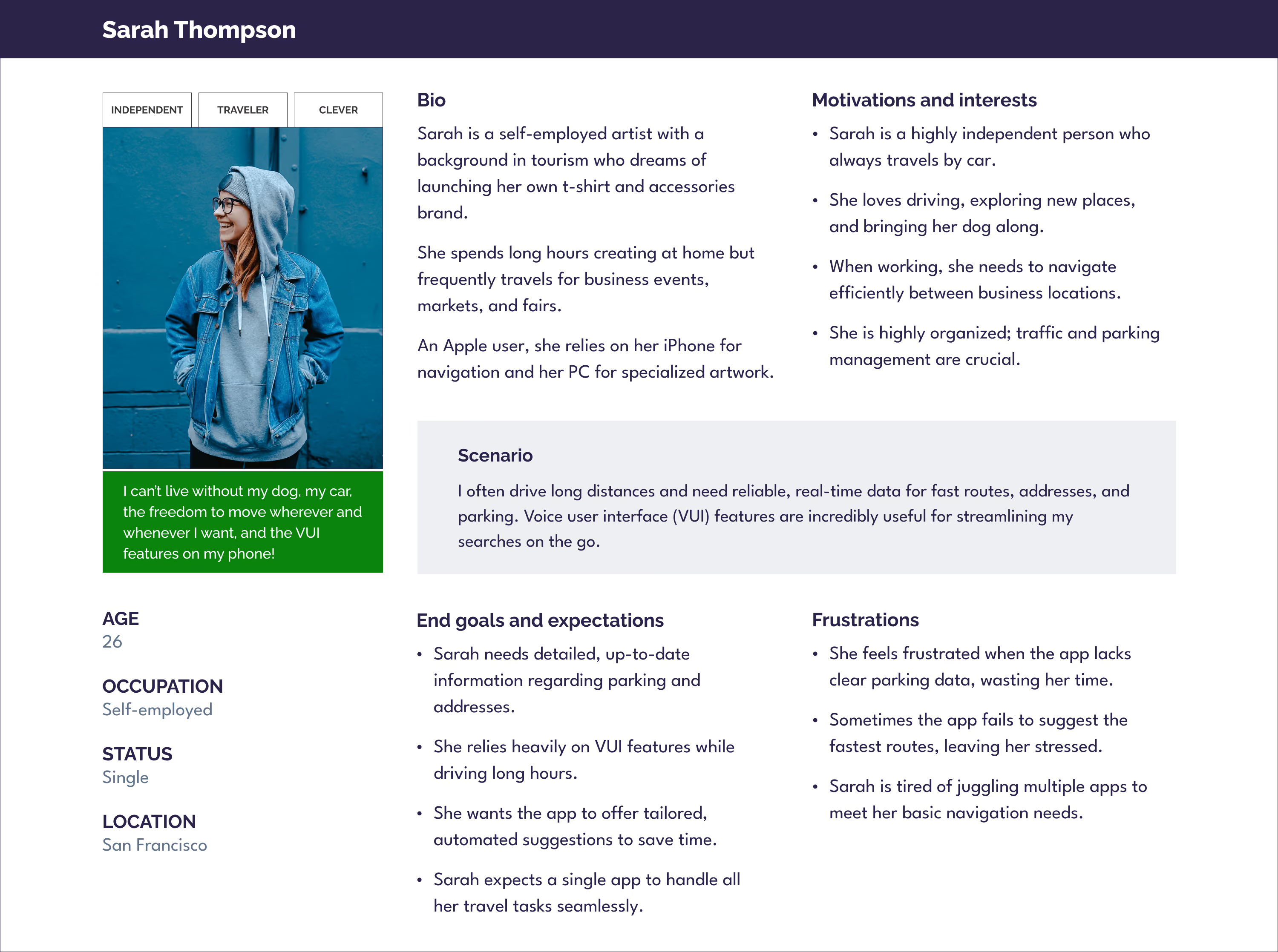
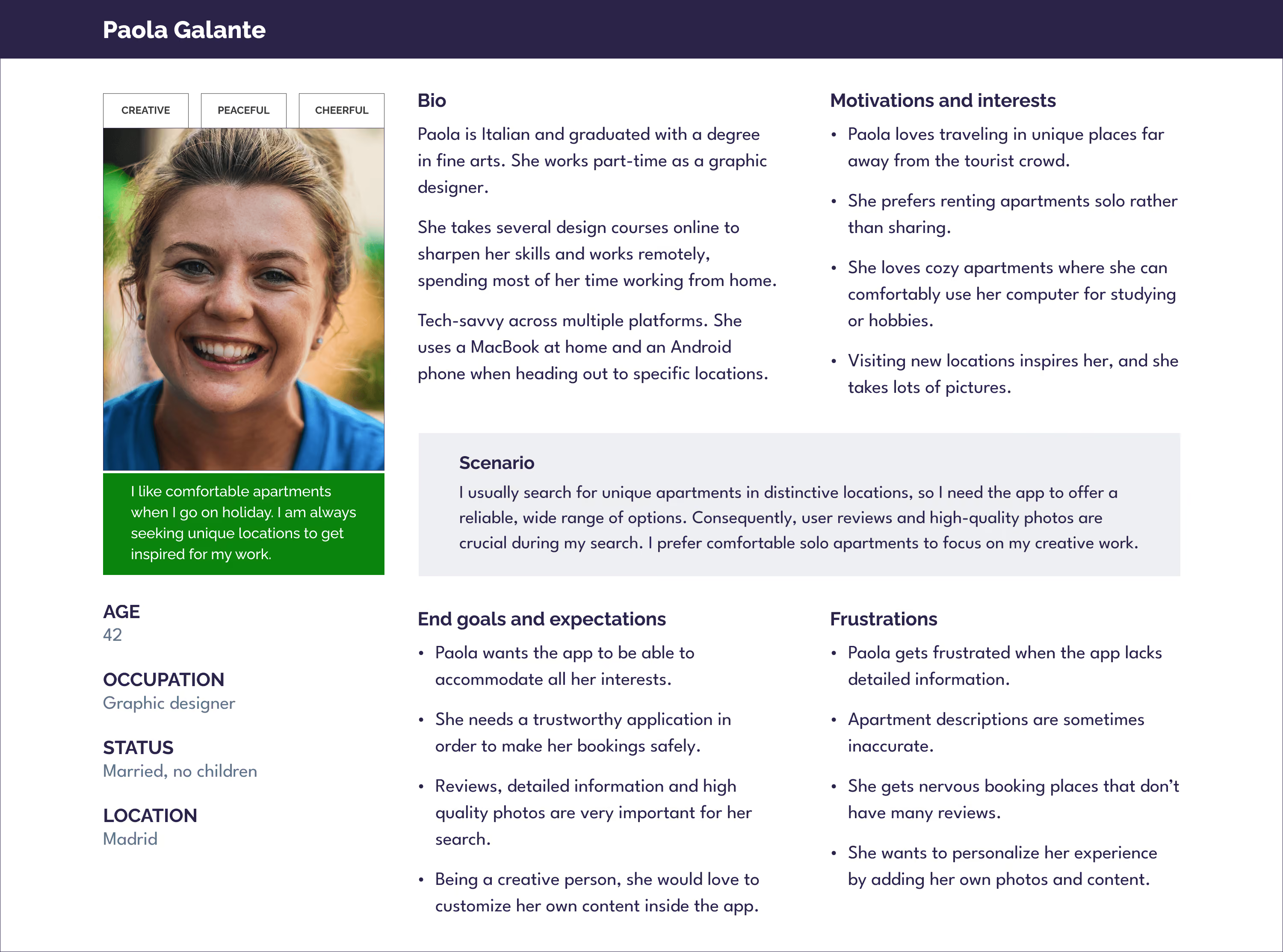
From the user interviews, I gathered key insights that led to three distinct user personas.
Creating these personas clarified user contexts, attitudes, and behaviors, and they became a valuable reference throughout the rest of the design process.
User flow
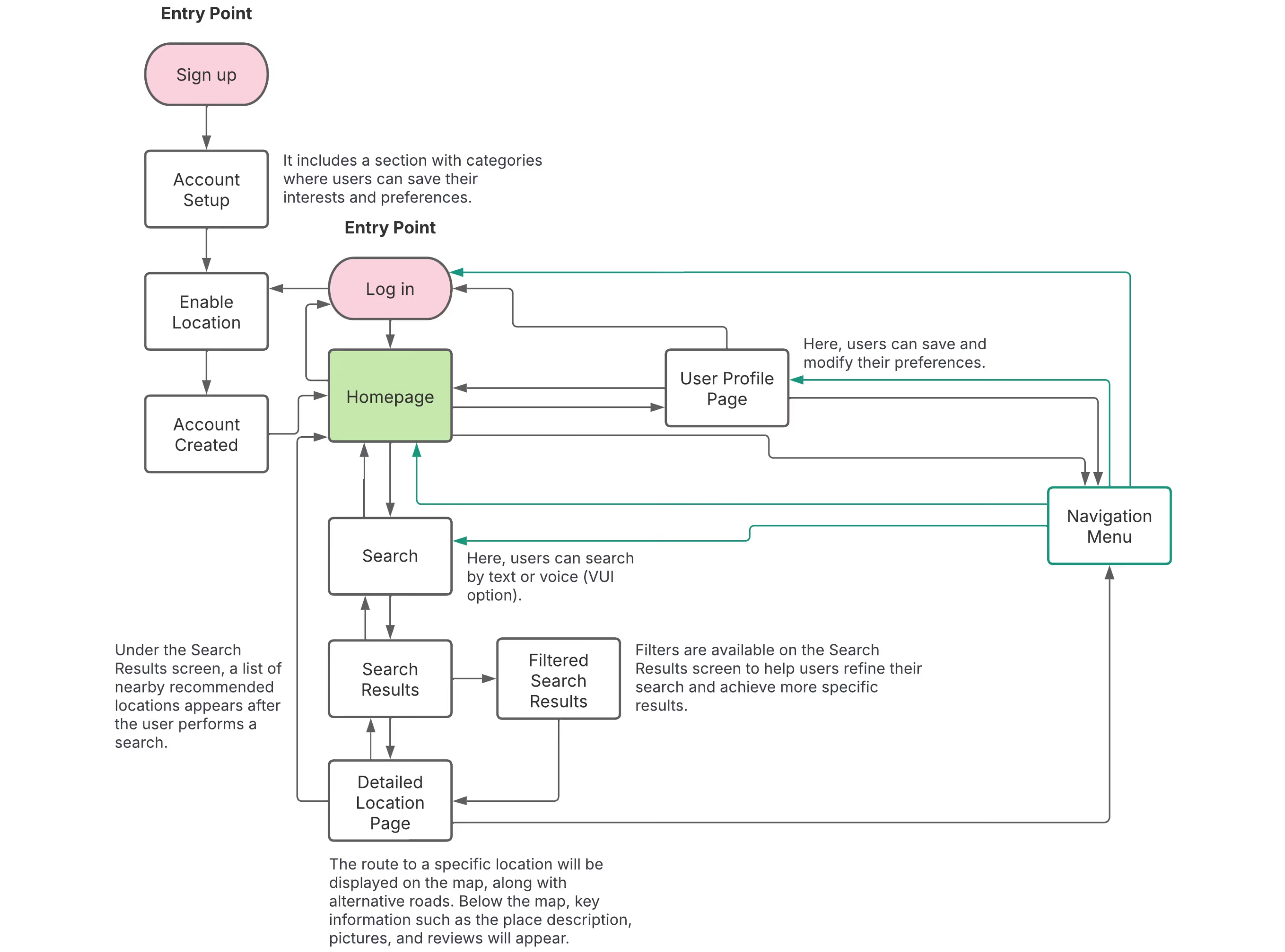
User flow created with Lucidchart.
Prototype
Low-fidelity wireframes
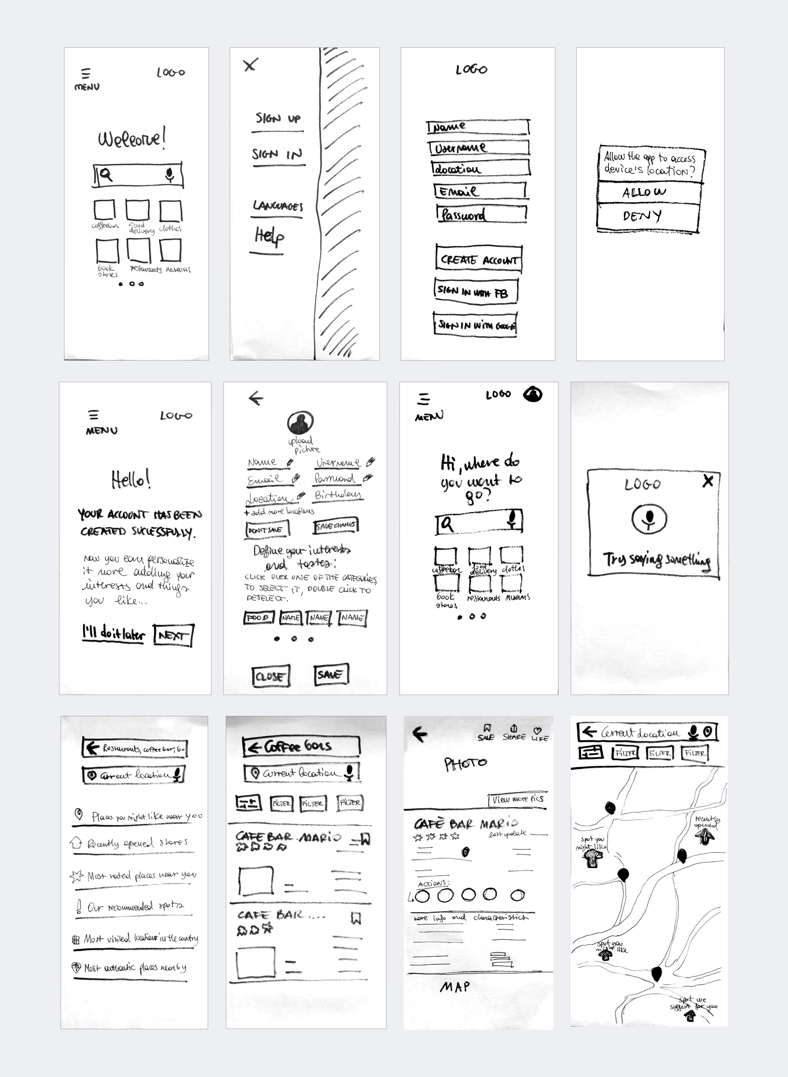
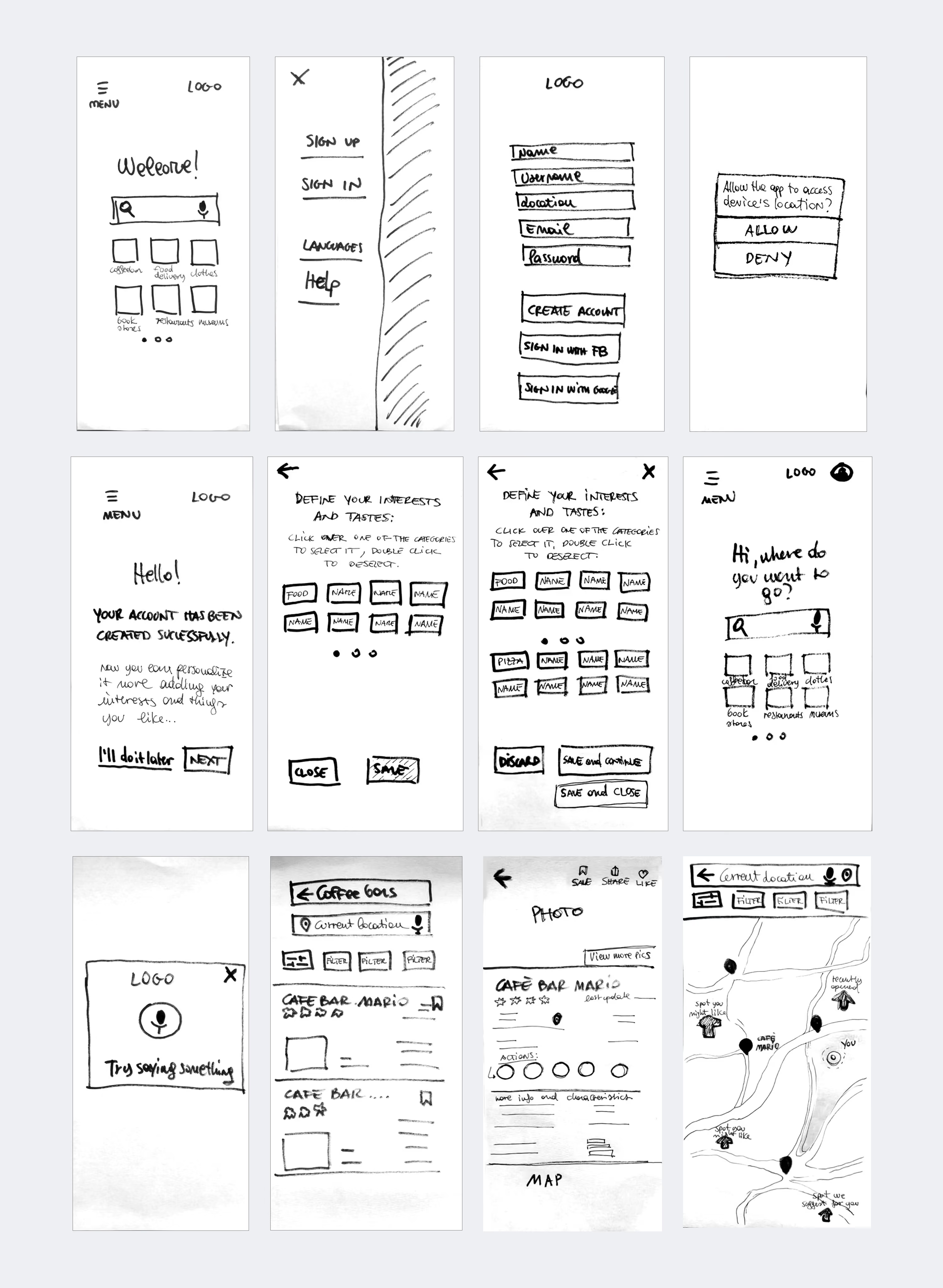
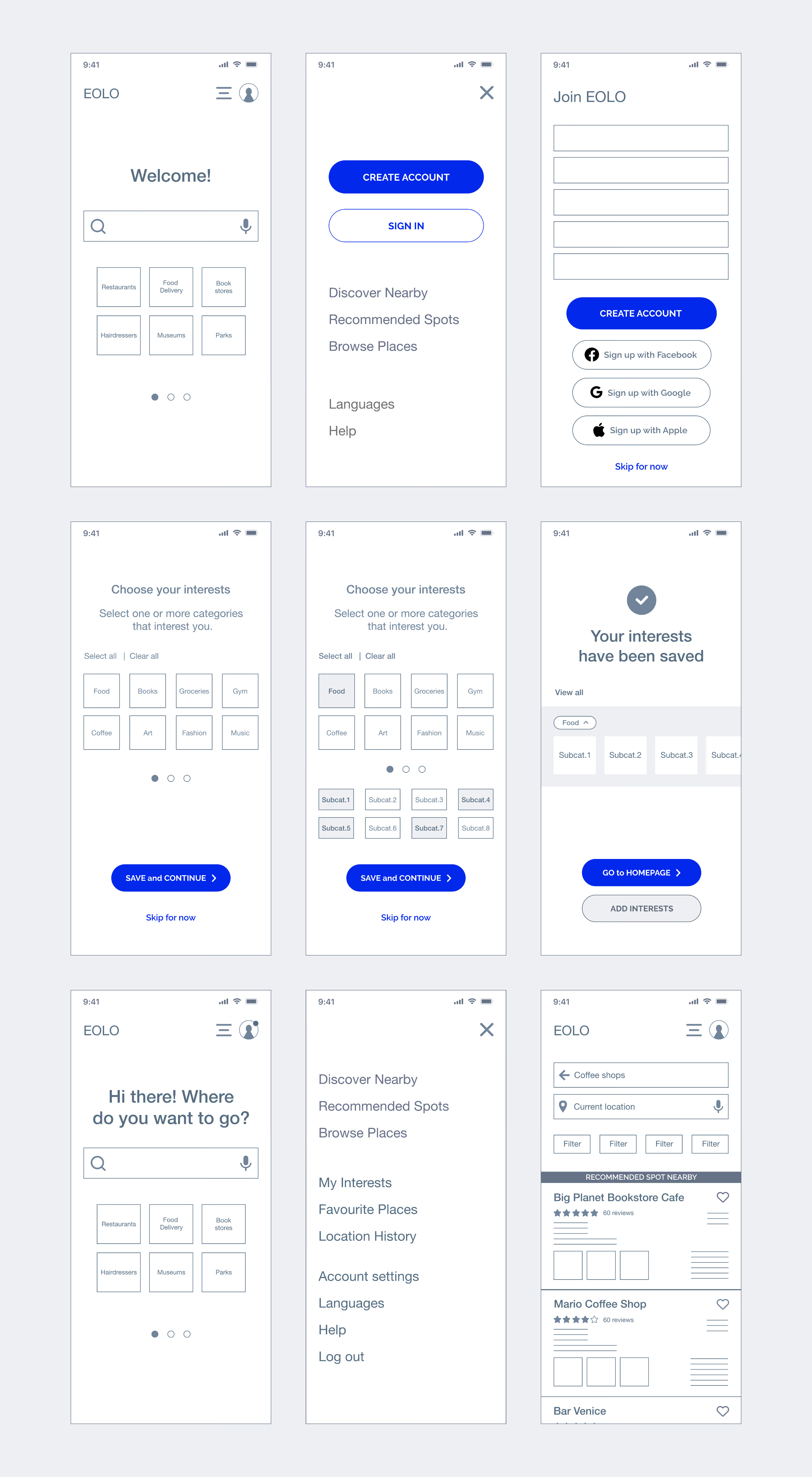
Using a rapid prototyping approach, I developed these initial sketches to explore the core user flow. After four iterations, informed by user-testing insights, I implemented several structural refinements. These changes created a more intuitive experience and established a solid foundation for the mid- and high-fidelity designs.
This presentation shows the first and fourth iterations:
User testing
Goals
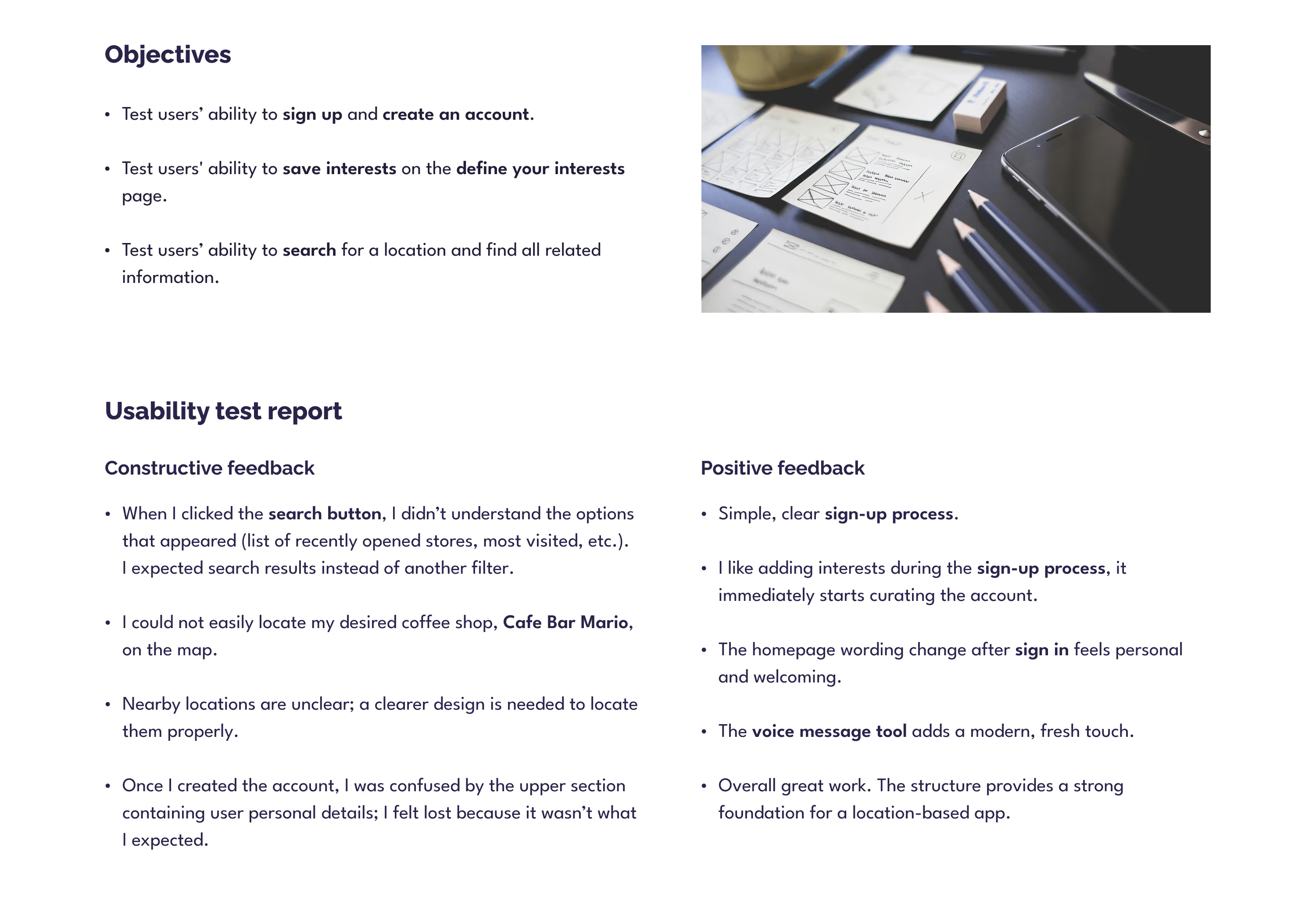
The goal was to evaluate mobile usability with three users, observing whether they could easily understand the information architecture, navigate, and complete specific tasks.
Mid fidelity wireframes
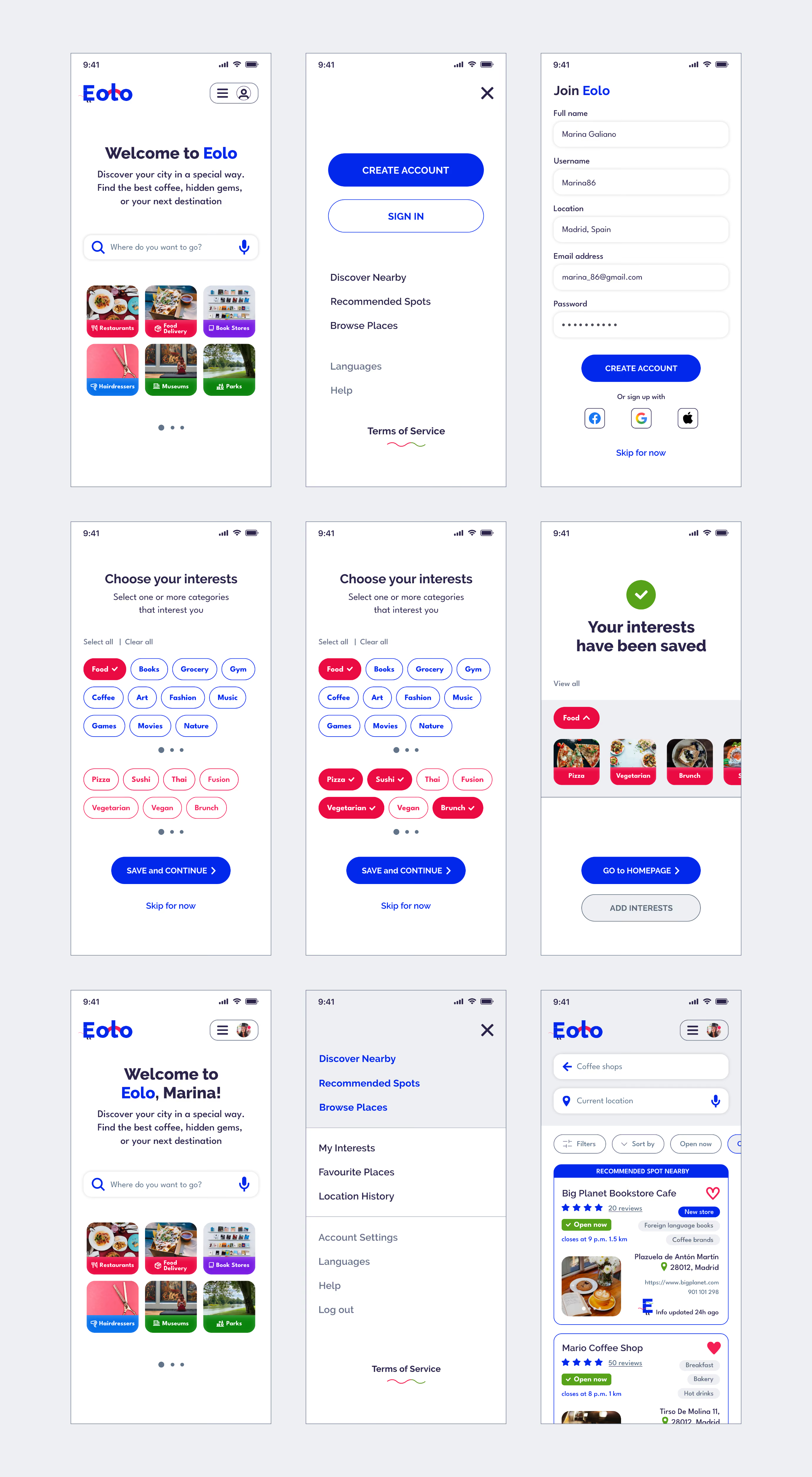
High fidelity wireframes
Visual identity
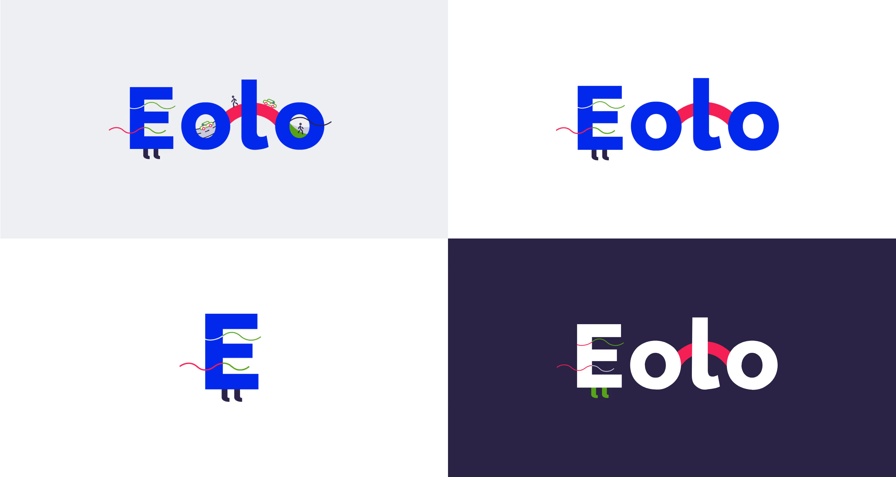
Logotype
Four representations of the Eolo brand identity: the master detailed version for large-scale displays, the simplified variant for smaller screens, the standalone 'E' isotype, and the inverted negative logotype for dark backgrounds.
Typography
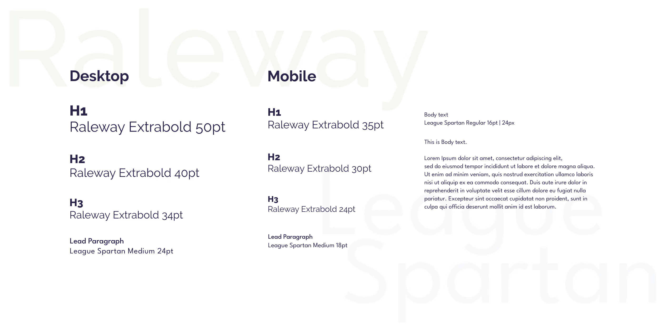
Raleway and League Spartan, two clean sans-serif Google fonts.
Raleway handles headings, buttons, and navigation for its elegant personality. League Spartan covers form fields, filters, and body text with its versatile clarity.
UI screens
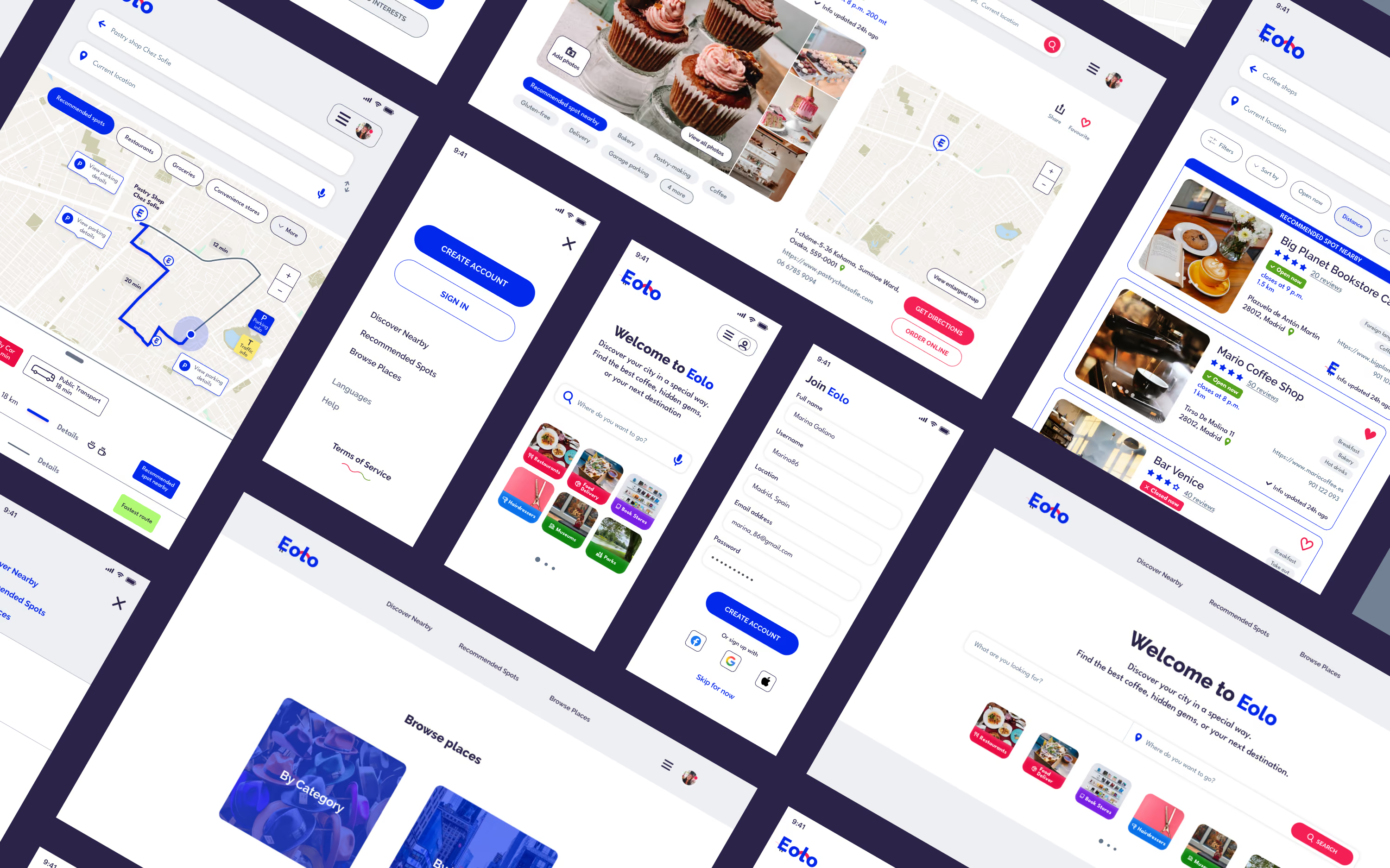
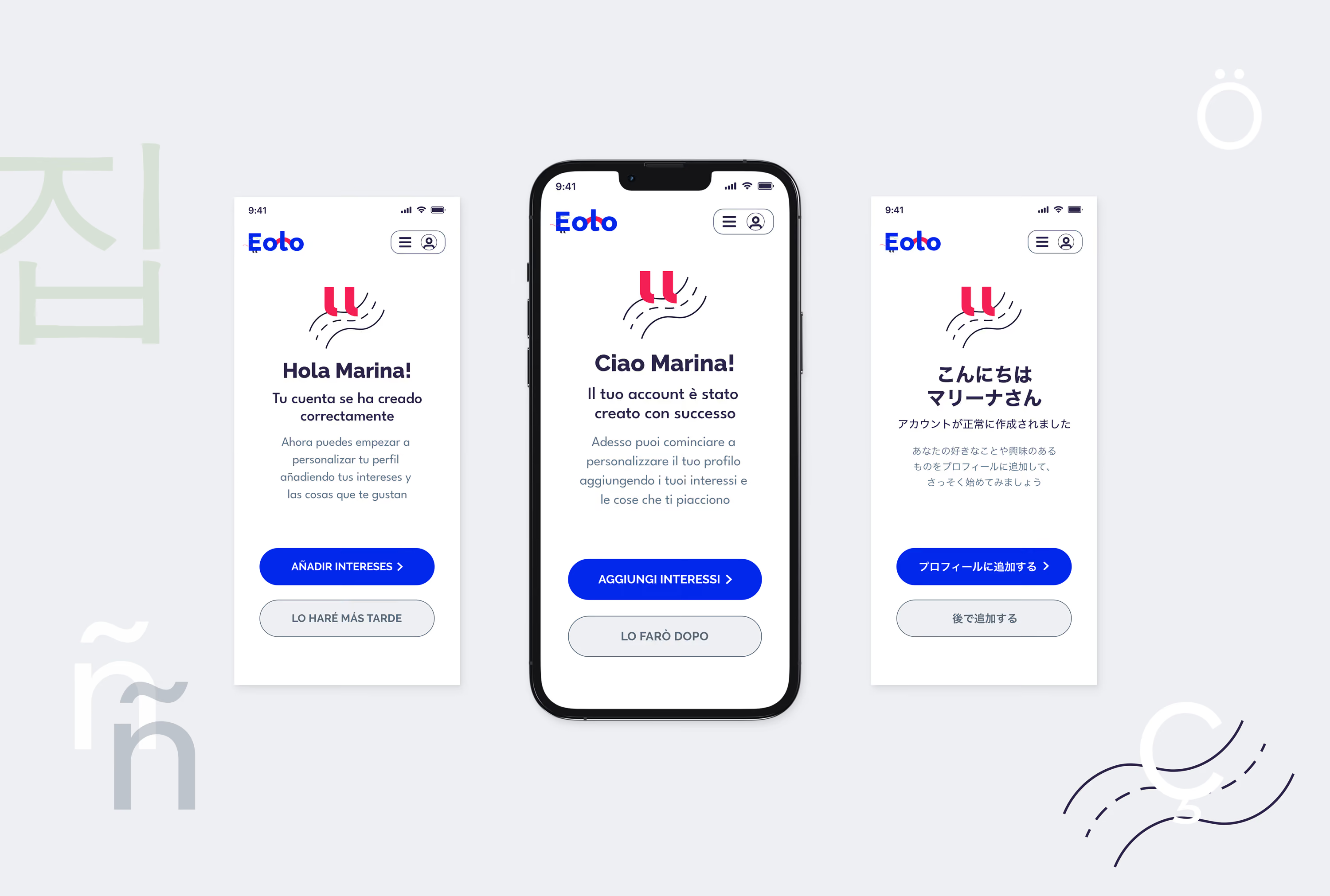
A selection of web-app viewports demonstrating the interface layout across key platform features and functional interaction patterns.
Choose and save interests
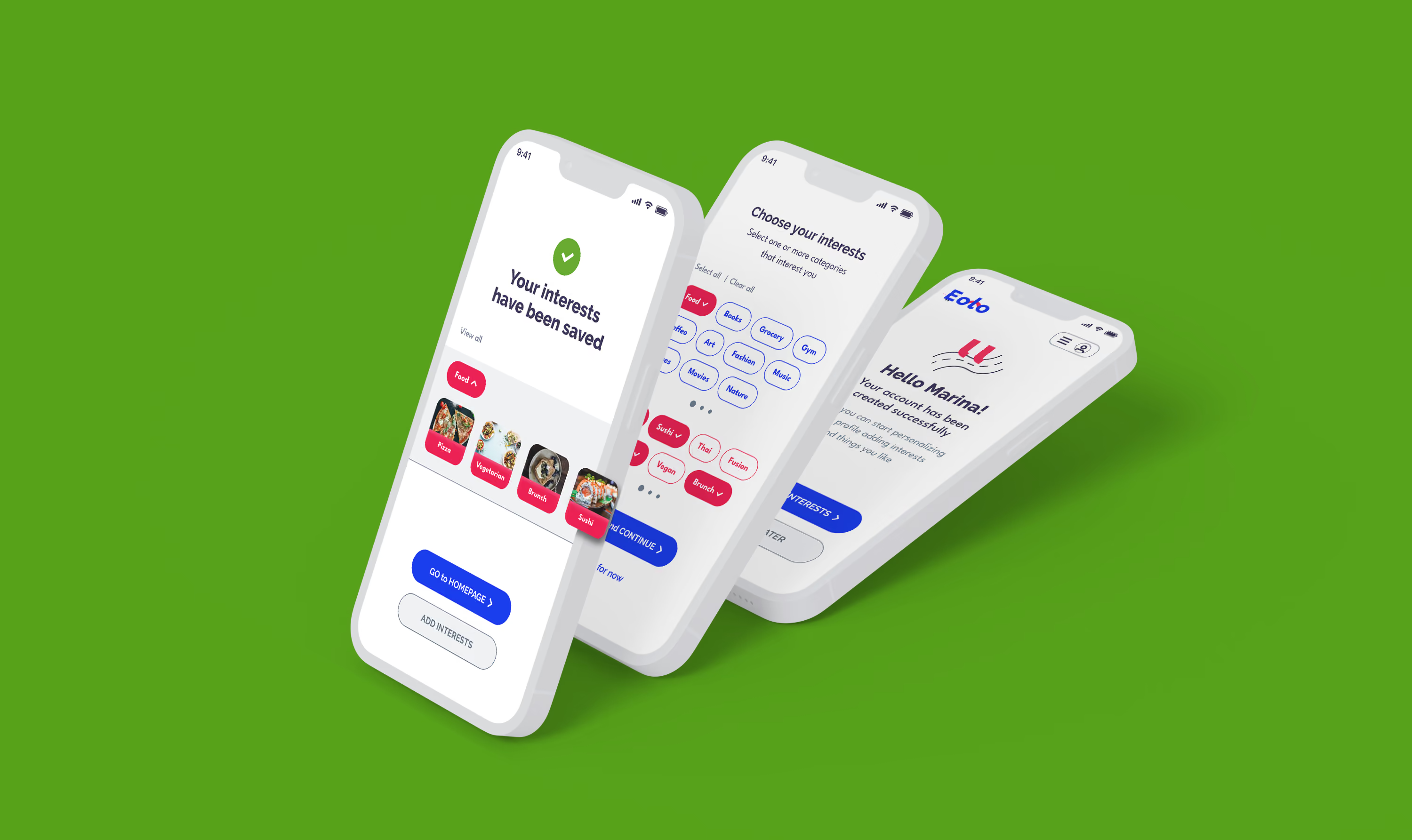
Instant personalization begins with selected interests.
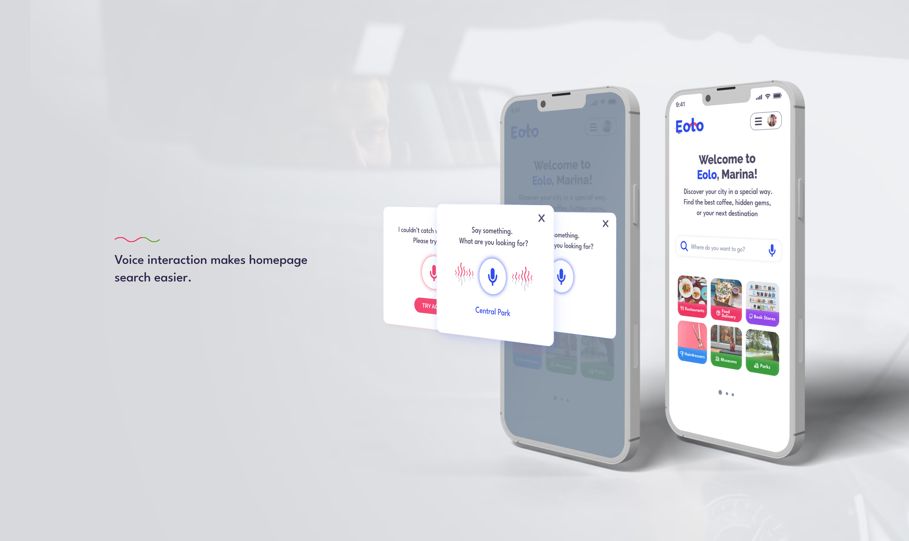
VUI features
The homepage brings voice interaction into the search experience, helping users discover places through a more natural conversational input.
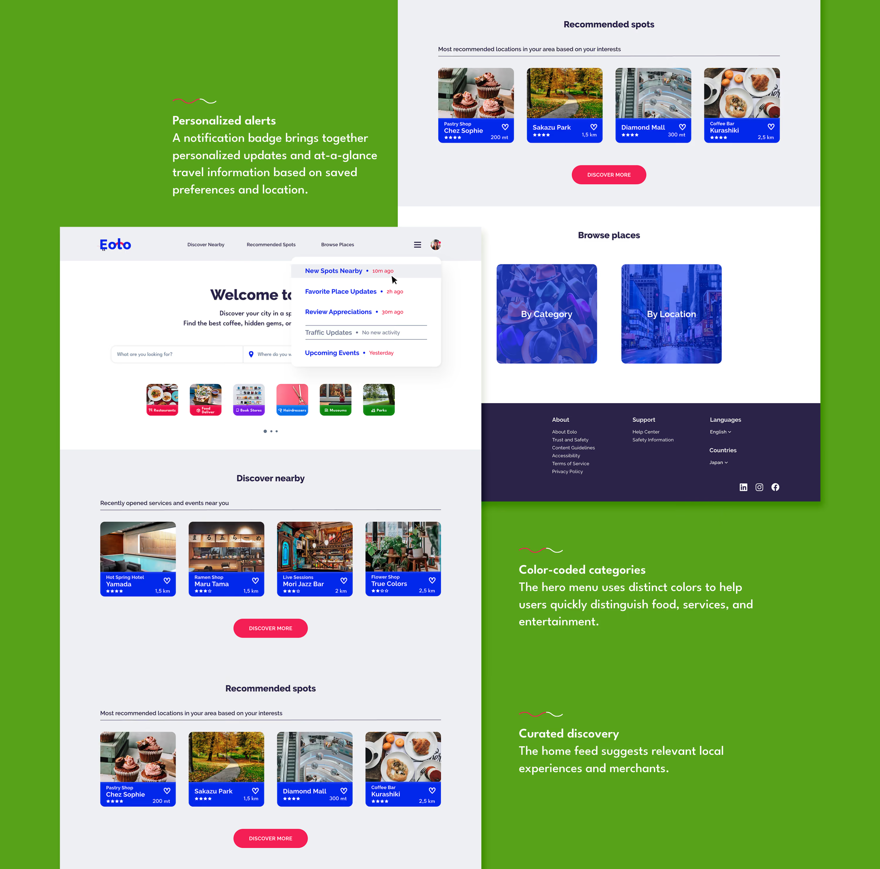
Desktop homepage
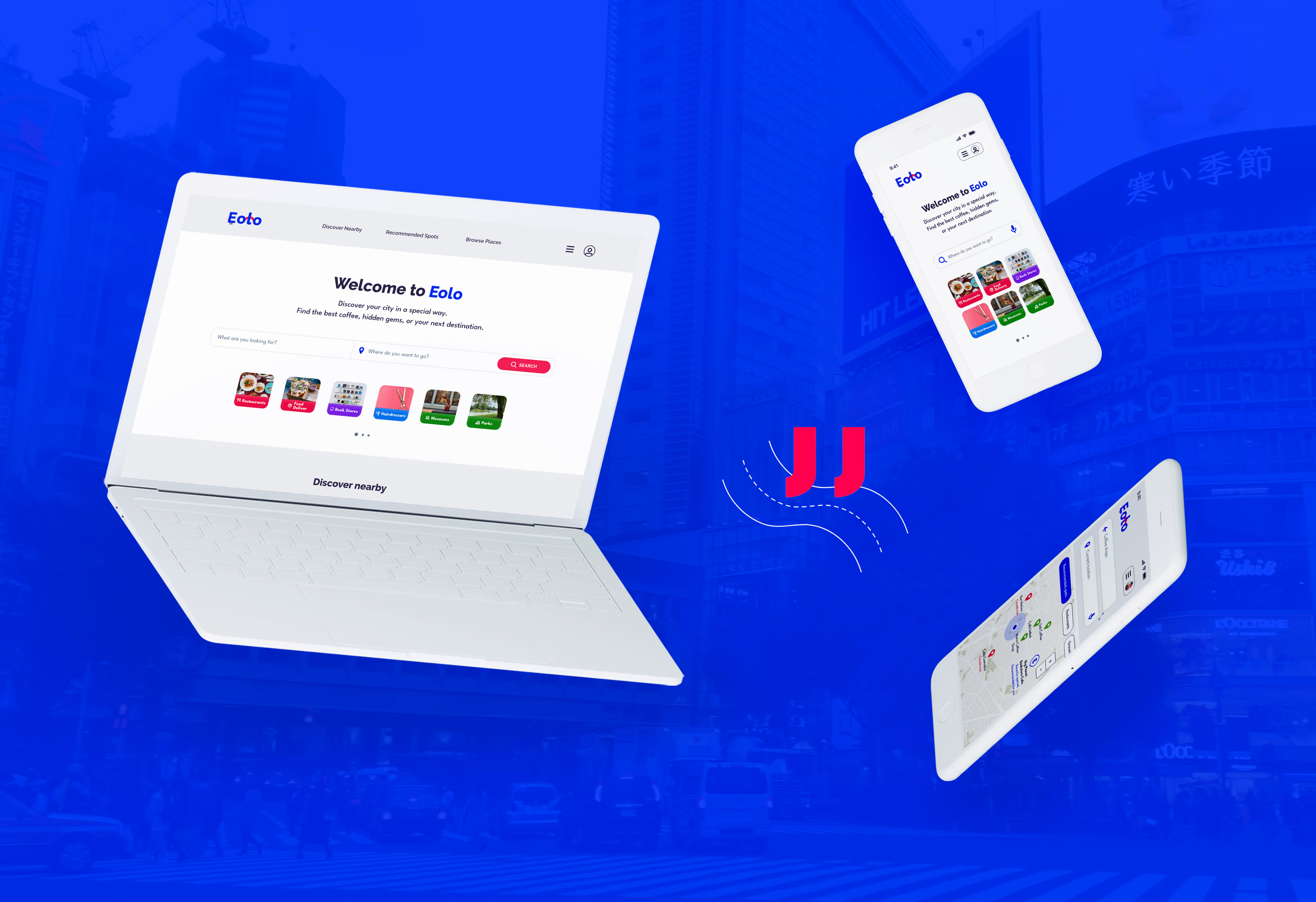
The desktop homepage helps users discover relevant places quickly through personalized alerts, clear category cues, and curated local recommendations.
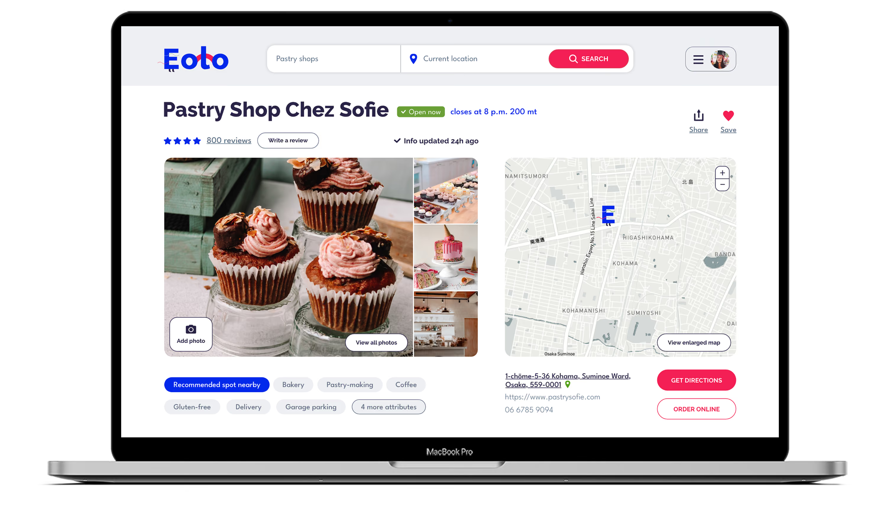
Place detail page
It foregrounds reviews and real-time updates to support quick decisions, then provides rich media and secondary details for deeper exploration.
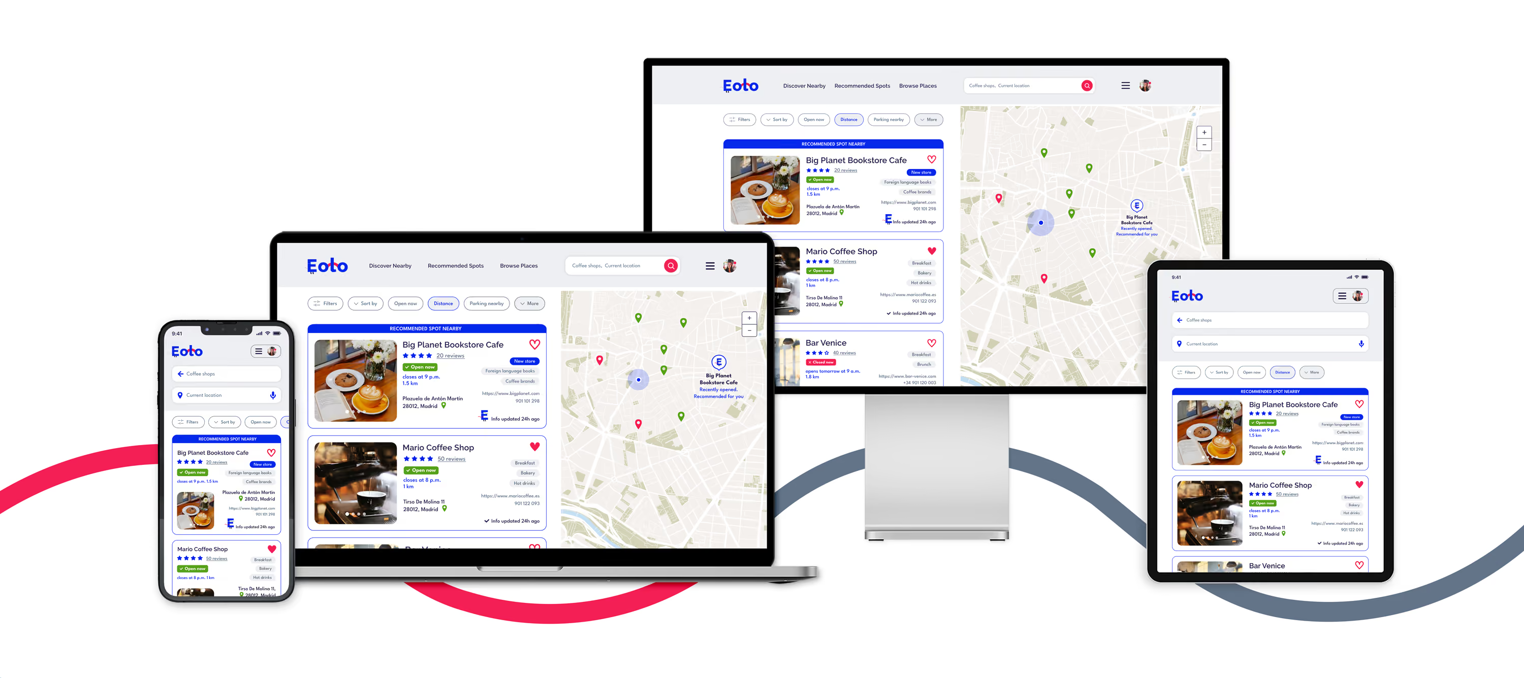
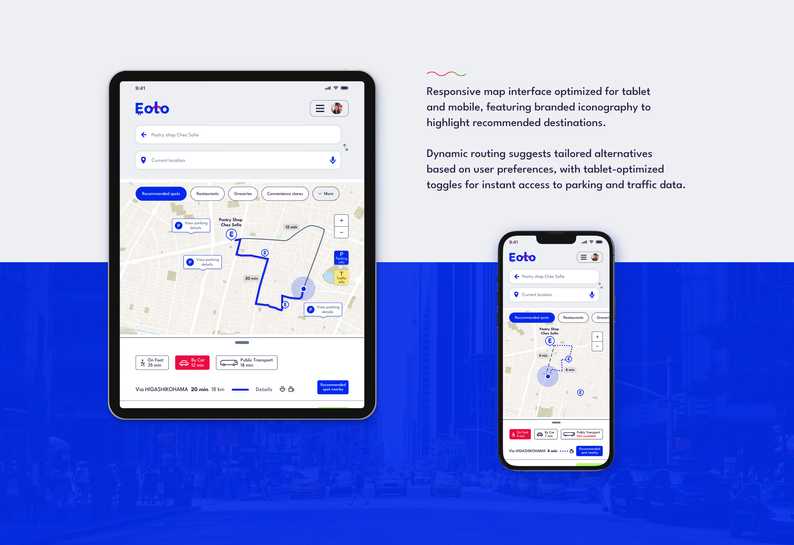
Responsive maps
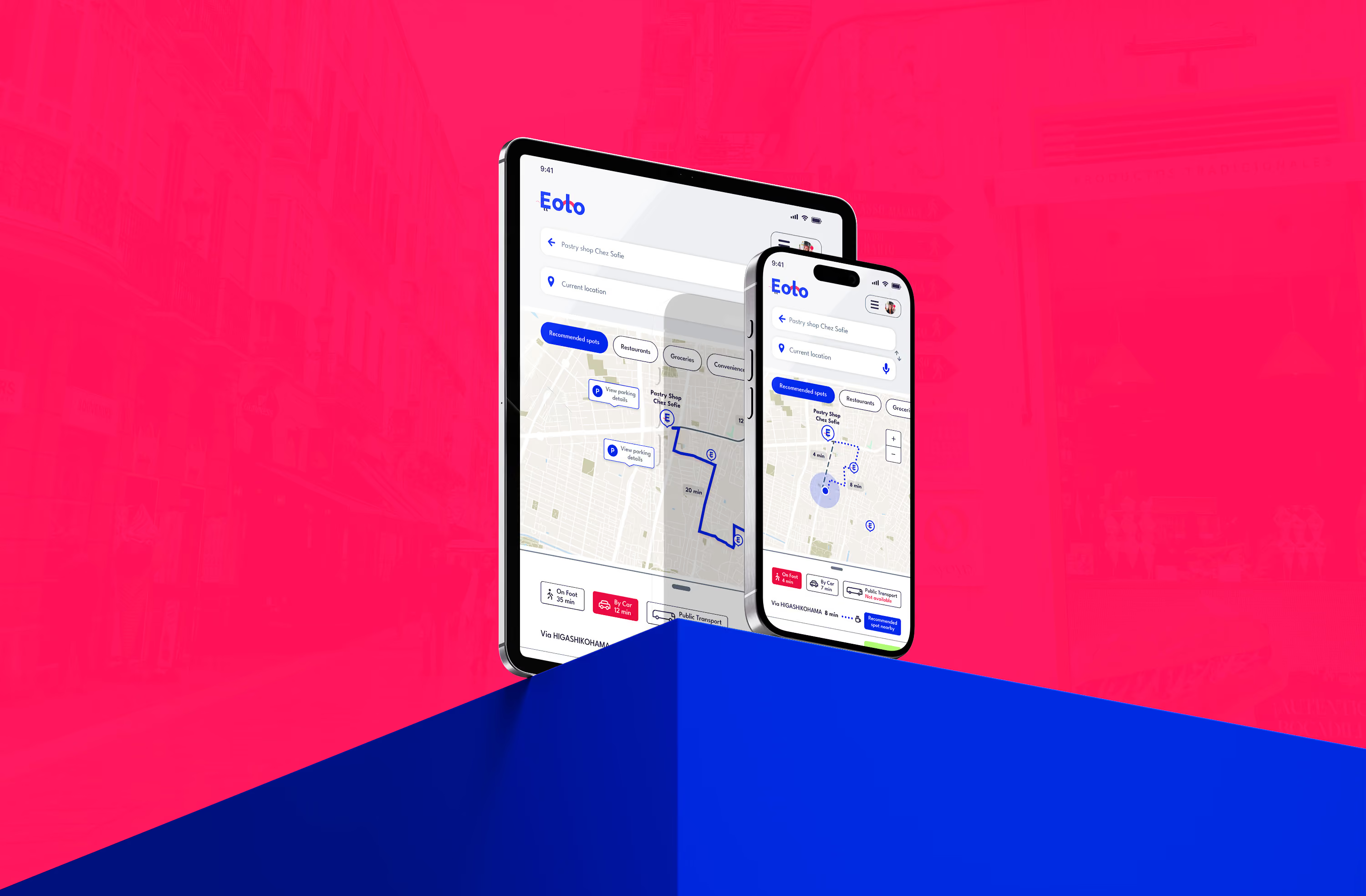
Maps experience brings route planning, recommended spots, and real-time travel information to tablet and mobile.
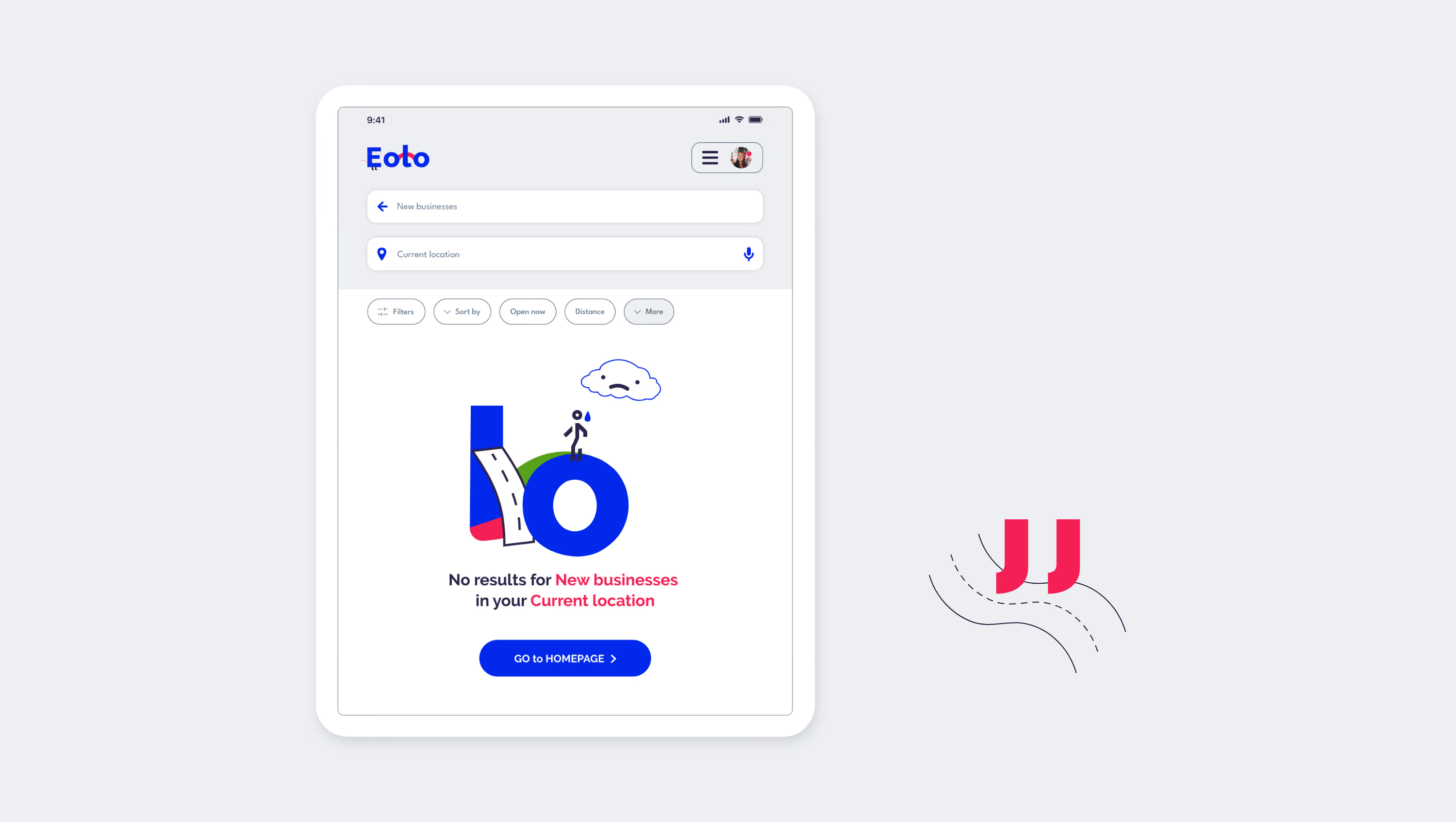
Empty state
A clear empty state guides users when no matching content is available.